

目录
- CMYK, RGB, and Pantone: the direct answer
- Why RGB colours change in printed books
- When Pantone is appropriate for a book
- Buyer checklist for colour-critical books
- File setup, paper, and proofing
- Choosing the right colour approach
- الخاتمة
CMYK is the standard colour mode for most book printing, while RGB is designed for screens. Pantone spot colours can help when a precise branded or special ink colour is required. This guide explains how to prepare book files and specify colour accurately.
CMYK, RGB, and Pantone: the direct answer
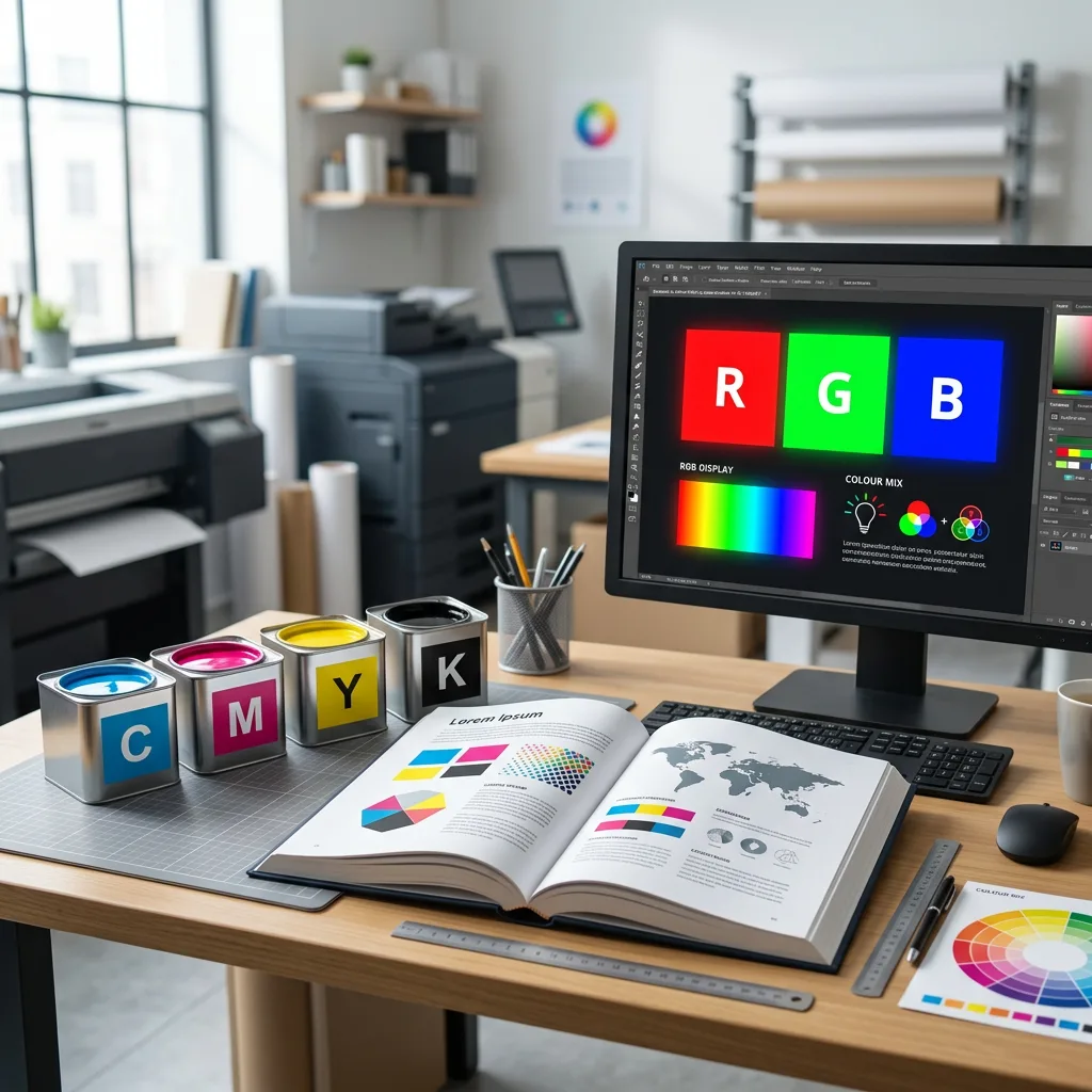
For CMYK vs RGB book printing, CMYK is normally the correct colour model for the final printed book. RGB is intended for digital displays and can contain bright colours that standard process inks cannot reproduce. Pantone is a proprietary spot-colour system used when a particular ink colour needs to be specified separately rather than built from CMYK process inks.
In practical terms, supply a print-ready CMYK PDF unless the printer has requested another workflow. Use Pantone only where a named spot colour is genuinely required, such as a corporate identity colour, a flat illustration colour, or a special ink effect. Converting files at the last minute can alter image appearance, especially saturated blues, greens, oranges, and fluorescent-looking screen colours.
The right choice depends on the content, printing method, paper stock, press workflow, and the level of colour control required. Colour-critical art, photography, and branded publishing projects benefit from early prepress discussion rather than relying on screen appearance alone.
Why RGB colours change in printed books

RGB and CMYK create colour in different ways. A monitor emits red, green, and blue light, so it can display vivid luminous colours. A printed page reflects light. CMYK printing uses cyan, magenta, yellow, and black inks on paper to create an image, and its reproducible range of colours is smaller than the range available on many screens.
When an RGB image is converted to CMYK, colours outside the printing gamut must be mapped to printable values. That is why an intense neon green on a screen may become a more muted green in the book, and a highly saturated blue may shift toward purple or lose brightness. This is a normal result of the different media, not necessarily a production error.
Do not judge final printed colour solely from an uncalibrated monitor, phone, or laptop. Screen brightness, display settings, ambient light, and colour profiles all influence what you see. For image-heavy publications, agree a colour-management process before production. The workflow is particularly important for artist monographs, portfolios, and illustrated editions; see this guide to colour management for art book printing for a more detailed discussion.
Common RGB-to-CMYK risks
- Over-saturated images: bright screen colours lose intensity after conversion.
- Inconsistent blacks: RGB black converts differently depending on the file and conversion settings.
- Mixed colour spaces: pages containing RGB, CMYK, and spot-colour elements can produce unpredictable separations if not checked.
- Late editing: changing image profiles or conversion settings after approval may change the intended look.
When Pantone is appropriate for a book
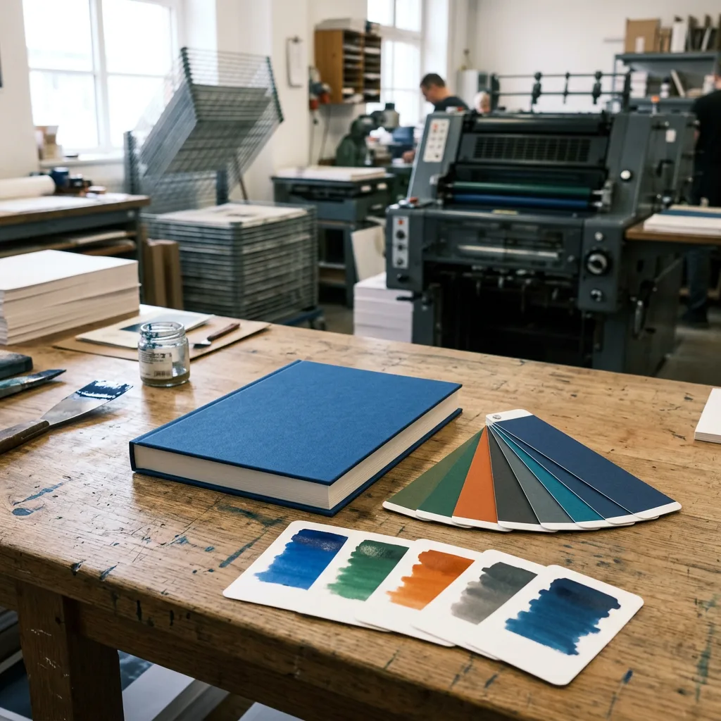
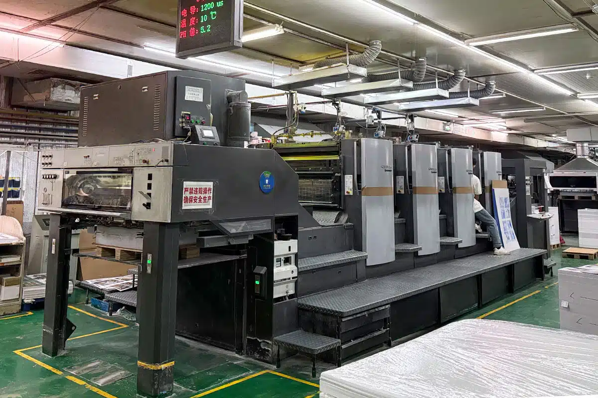
Pantone is useful when a colour needs to be printed as a dedicated spot ink rather than approximated with CMYK. A spot ink is mixed to a defined formula and printed on its own printing unit. It can provide a more consistent target for a specific brand colour, depending on the chosen Pantone library, paper, press conditions, and finishing process.
Common book applications include a one- or two-colour cover design, recurring corporate colours in a training manual, a logo colour that must remain distinct, or an accent colour used throughout a publication. Pantone can also be relevant for metallic, fluorescent, and certain special inks, although their availability and visual result must be confirmed for the individual project.
It is not automatically necessary to use Pantone simply because a brand has Pantone references. A full-colour photographic book is often printed in CMYK, with brand colours converted and managed within the process workflow. Adding spot colours may affect press setup, production route, and cost. It is most worthwhile when the visual or brand requirement justifies the extra specification.
Specify Pantone clearly
Name the exact Pantone reference in the artwork and keep spot-colour swatches consistent across the file. Do not create several differently named swatches for the same colour. Clarify whether the reference is intended for coated or uncoated stock, because ink appearance changes with paper surface and absorbency. If a metallic or fluorescent effect is essential, request confirmation before finalising the design.
Buyer checklist for colour-critical books
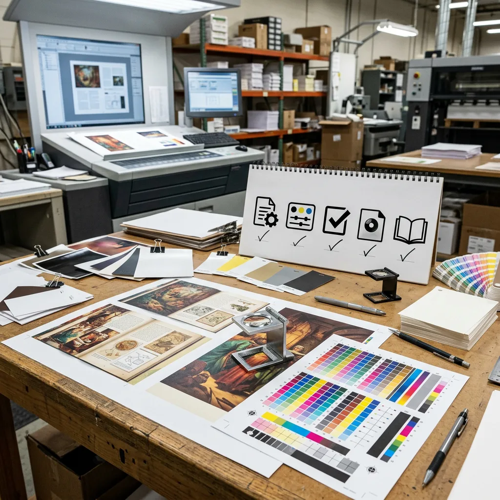
Use this checklist before asking a printer to quote or begin prepress. It helps avoid assumptions that can affect cost, lead time, and final colour.
- Confirm the intended output: Is the book for general reading, retail, brand communication, photography, or art reproduction?
- Check colour modes: Convert raster images and design elements according to the agreed production workflow. Review any remaining RGB objects and spot swatches.
- Choose the paper early: Coated, uncoated, textured, and tinted papers reflect colour differently. The same CMYK values will not look identical on every stock.
- Identify brand-critical colours: State whether a colour is an approximate CMYK match or requires a named Pantone spot ink.
- Consider binding and cover construction: Cover materials, lamination, and board can alter perceived contrast and colour. For photographic products, review lay-flat binding and paper options for photo and memory books alongside the colour specification.
- Plan proof approval: For colour-sensitive work, define what proof type will be reviewed and who has approval authority.
- Keep source files available: If corrections are needed after preflight, editable files and linked high-resolution images make revisions easier.
Assumptions matter. A digital proof can help check layout and content, but it may not represent the exact colour of the final press sheet. Paper shade, ink density, finishing, and viewing light all affect perceived colour. A physical proof or press-approved reference may be appropriate when colour accuracy is a key purchasing criterion.
File setup, paper, and proofing
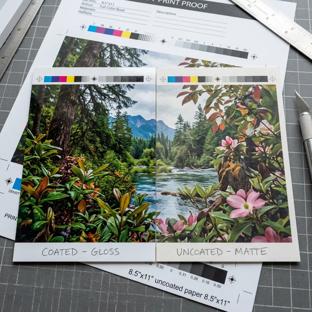
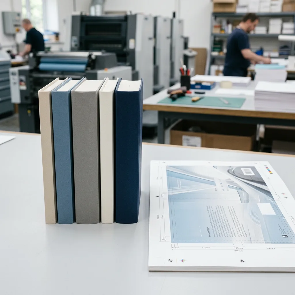
A reliable book-printing workflow begins before export. Build images at sufficient effective resolution for their printed size, use the agreed colour profile, and keep type, graphics, and images properly separated and linked. Export the PDF using settings agreed with the printer. Bleed, trim marks, font handling, total ink coverage, and rich-black construction should also be checked during prepress.
Paper selection has a direct effect on colour. Coated paper usually delivers sharper detail and stronger apparent saturation than uncoated paper because less ink is absorbed into the surface. Uncoated stocks can suit text-led, natural, or tactile publications, but images may appear softer or more subdued. A gloss or matte film lamination on the cover also changes contrast, reflection, and the perceived depth of dark colours.
For a premium image-led title, paper weight and finishing choices should be considered together with the colour target. This guide to coffee table book paper weights and finishes can help buyers assess those connected decisions.
Proofing should match the level of risk. A PDF proof is useful for copy, page sequence, trim, and layout checks. A hard proof provides a physical reference under controlled viewing conditions, although the degree to which it predicts final production depends on the proofing system and agreed conditions. Avoid approving an important colour based only on a small on-screen preview.
Choosing the right colour approach
For most commercial books with photographs, illustrations, and full-colour pages, CMYK process printing is the practical standard. It supports a wide range of images and is the normal basis for many offset and digital colour workflows. Convert and review RGB content before production rather than expecting the press to reproduce screen colour unchanged.
Use RGB only where the final product is intended for screen viewing, or retain it temporarily in an editing workflow when instructed by the printer. Do not assume that leaving a PDF in RGB will preserve brighter printed colours. The file will still need to be interpreted or converted for the selected production process.
Use Pantone spot colours where a dedicated, identifiable colour is required and the project budget and production plan support it. This is often most effective for simple graphic elements, covers, branded inserts, or design systems with a limited colour palette. Discuss the proposed ink count and paper before approving artwork.
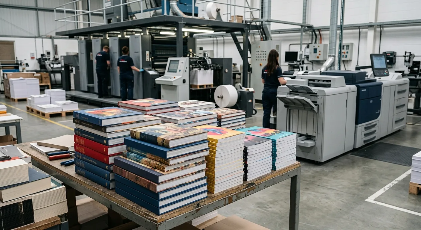
Printing method can also affect the available workflow and economical quantity range. Buyers comparing production routes can review offset, digital, and print-on-demand book printing methods before locking the specification.
الخاتمة
CMYK is the foundation of standard book printing, RGB is a screen-based colour space that requires careful conversion, and Pantone is a targeted option for specified spot colours. The best result comes from making colour decisions early, selecting paper with the intended visual effect in mind, and agreeing the proofing approach before production.
For an accurate discussion of a custom book project, share the product type, trim size, page count, quantity, paper or binding preference, finish, current file status, destination country, and any CMYK or Pantone colour requirements.