Élever l'art grâce à la spécification de l'impression
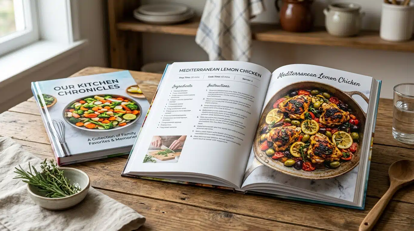
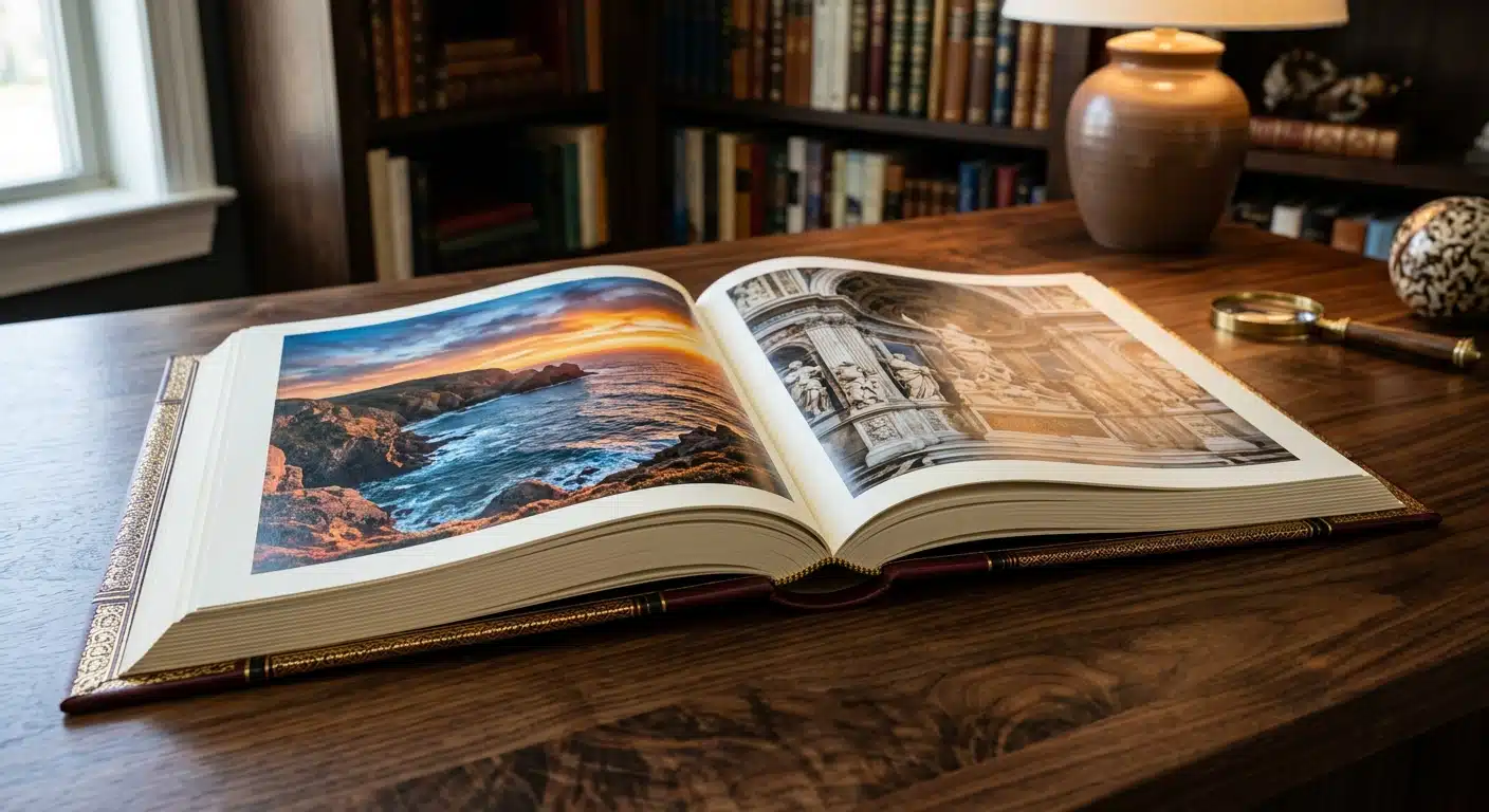
Pour les photographes, les artistes et les galeristes, un livre de salon est plus qu'un portfolio : c'est une extension physique de l'œuvre d'art elle-même. La valeur perçue de ces publications repose en grande partie sur des qualités tactiles : le poids de la page qui se tourne, la façon dont la lumière interagit avec l'encre et la durabilité de la reliure.
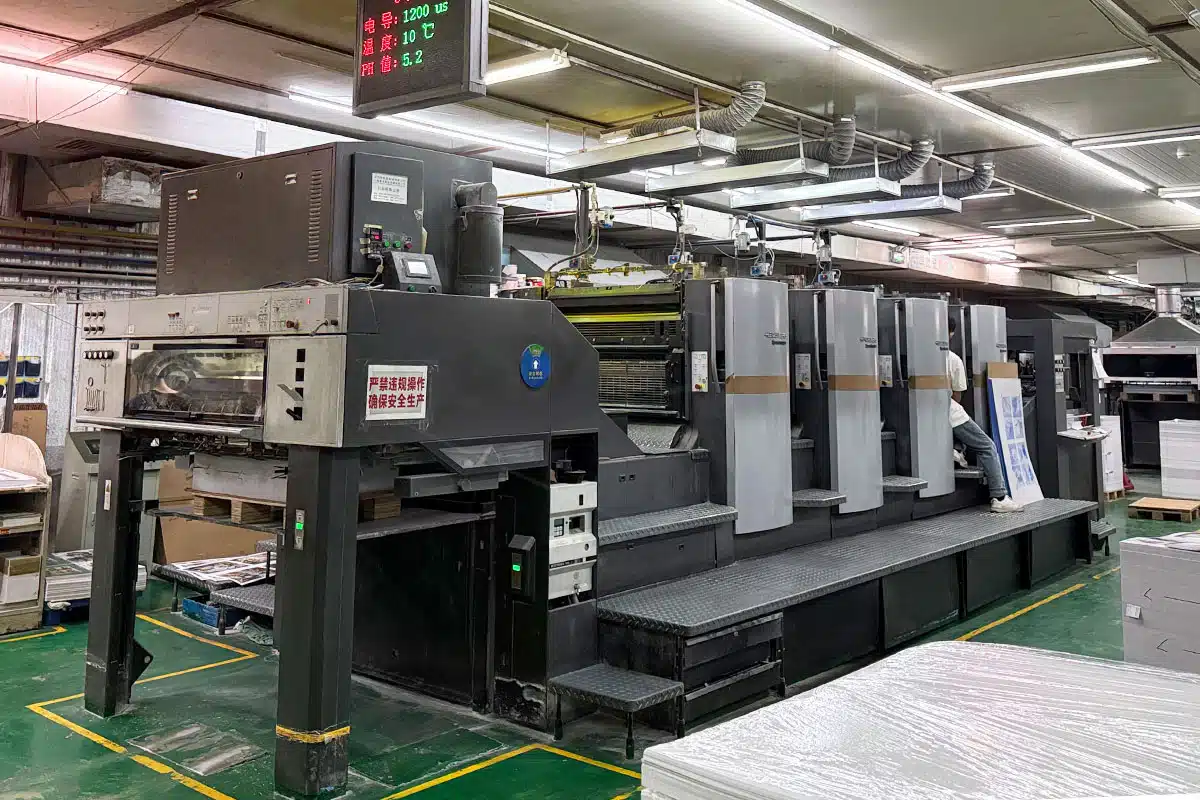
Dans le monde de l'impression offset B2B, l'obtention d'une impression de luxe nécessite une spécification précise de la densité du papier (GSM) et des traitements de surface. Les paramètres standard de l'impression commerciale sont souvent insuffisants pour les projets à forte composante visuelle. Ce guide présente les choix techniques nécessaires pour produire des livres de table de qualité galerie qui résistent à l'épreuve du temps.
Comprendre le grammage du papier (GSM) pour les livres d'art
Le grammage du papier est mesuré en grammes par mètre carré (GSM). Dans le contexte des livres de table de luxe, l'objectif est d'éviter les transparences (opacité) tout en garantissant un drapé élégant des pages lorsque le livre est ouvert.
Poids des blocs de texte standard et de luxe
- 128gsm - 157gsm : Il s'agit de la norme industrielle pour les brochures et les magazines de haute qualité. Bien que rentable, le 128 g/m² peut sembler trop léger pour un livre d'art haut de gamme. Le grammage 157 g/m² est une référence sûre pour un toucher substantiel sans encombrement excessif.
- 170gsm - 200gsm : Cette gamme représente le "sweet spot" pour les livres de photographie de luxe. Le papier est suffisamment épais pour supporter une forte couverture d'encre sans se déformer ni déteindre sur le verso. Sa rigidité est un gage de qualité pour le lecteur.
- Supérieure à 200 g/m² : Bien qu'impressionnant, le papier de plus de 200 g/m² peut rendre un livre difficile à feuilleter si la méthode de reliure n'est pas adaptée. Il est préférable de le réserver aux livres comportant peu de pages (moins de 100 pages) afin d'éviter que le dos ne devienne trop lourd.
Epaisseur du carton de couverture
Pour les livres à couverture rigide, le carton gris interne détermine la rigidité de la couverture. Une couverture rigide standard peut utiliser un carton de 2 mm ou de 2,5 mm. Pour une couverture vraiment substantielle et luxueuse, en particulier pour les livres de grand format (par exemple, 11×14 pouces), l'utilisation d'un carton gris de 3 mm permet d'obtenir un poids et une durabilité plus importants.
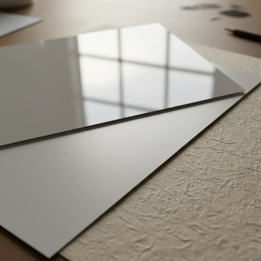
Finitions de surface : Équilibrer la vibration et la lisibilité
L'interaction entre l'encre et la surface du papier définit la qualité finale de l'image. Le choix entre un papier brillant, mat ou non couché est une décision stratégique basée sur le type d'art reproduit.
Papier d'art brillant
Meilleur pour : Photographies à fort contraste, paysages et images de produits commerciaux.
La couche brillante maintient l'encre à la surface du papier au lieu de l'absorber. Cela permet d'obtenir les détails les plus nets et les couleurs les plus vives. Toutefois, la forte réflectivité peut provoquer des éblouissements sous une lumière directe, ce qui peut perturber la lecture dans les sections comportant beaucoup de texte.
Papier d'art mat
Meilleur pour : Portraits, beaux-arts et photographies en noir et blanc.
Le papier mat offre une surface sophistiquée, non réfléchissante et lisse au toucher. Il est excellent pour la lisibilité. En contrepartie, les revêtements mats peuvent légèrement atténuer le contraste des couleurs par rapport au brillant. Pour y remédier, l'impression offset de haute qualité utilise souvent un "vernis brillant ponctuel" sur les images elles-mêmes pour leur redonner de l'éclat tout en conservant la matité du papier environnant.
Finition soie ou satin
Meilleur pour : Le juste milieu polyvalent.
La soie (souvent appelée satin) est le choix le plus populaire pour les livres de luxe modernes. Elle offre une excellente reproduction des couleurs, semblable à la brillance, mais sans les reflets. Elle offre une texture raffinée et de qualité supérieure qui convient aussi bien aux textes qu'aux images.
Papier non couché sans bois
Meilleur pour : Illustrations artistiques, aquarelles et sujets organiques.
Le papier non couché a une texture plus rugueuse et naturelle. Il absorbe davantage d'encre, ce qui donne des images plus douces et une légère perte de netteté (engraissement du point). Bien qu'il ne soit pas recommandé pour la photographie technique de haute précision, il transmet une esthétique organique et artisanale très appréciée dans des marchés de niche spécifiques.
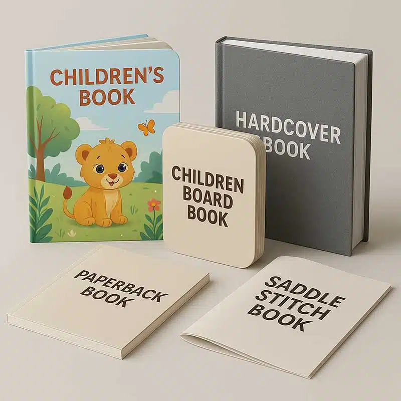
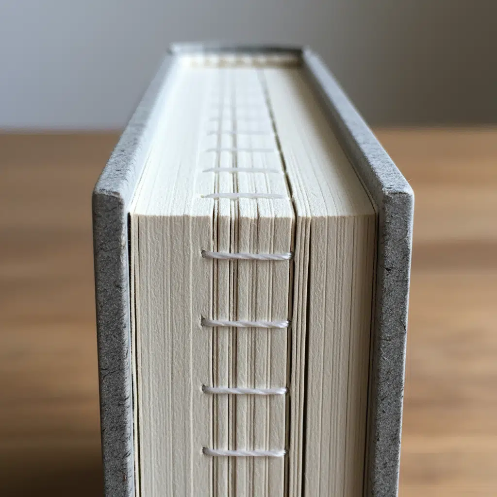
Reliure et effets spéciaux
Le processus de fabrication des livres de luxe ne se limite pas à l'impression des pages. La construction et les finitions sont essentielles.
Reliure cousue Smyth (section cousue)
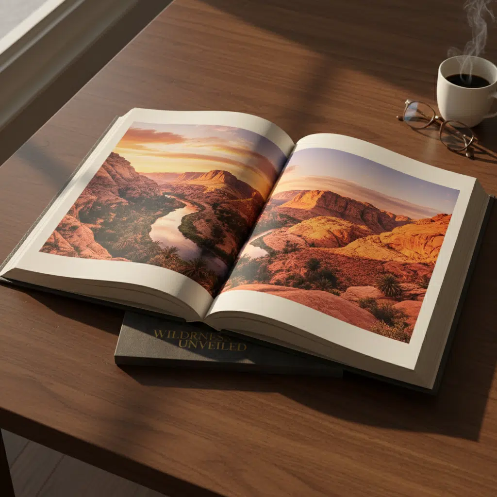
Pour tout livre de table basse, Reliure cousue Smyth est obligatoire. Contrairement à la reliure parfaite (uniquement avec de la colle), la reliure cousue permet au livre d'être complètement à plat lorsqu'il est ouvert. Cette caractéristique est essentielle pour les photos panoramiques qui s'étendent sur deux pages (images croisées), car elle permet de ne pas perdre de détails dans la gouttière.
Traitements de couverture
Pour différencier un livre en rayon, pensez à ces finitions post-impression :
- Marquage à la feuille : Application d'une feuille métallique d'or, d'argent ou de couleur sur le titre ou le logo.
- Gaufrage/Embossage : Création d'une dépression tactile ou d'un relief sur le matériau de couverture (souvent du lin ou du tissu).
- Spot UV : Un vernis transparent très brillant appliqué uniquement sur des zones spécifiques (comme une photo sur une couverture mate) pour créer un contraste.
- Pochettes de poussière : Un emballage en papier amovible qui ajoute une couche supplémentaire de protection et d'espace marketing.
Prépresse et assurance qualité
Lorsque l'on produit des milliers d'exemplaires, la cohérence est essentielle. Les imprimeurs professionnels utilisent des protocoles spécifiques pour s'assurer que le résultat final correspond à la vision de l'artiste.
Gestion des couleurs
Les fichiers doivent être préparés en mode CMJN. Les fichiers RVB (utilisés pour les écrans) ont une gamme de couleurs plus large que l'encre physique ; les convertir correctement permet d'éviter des changements de couleur inattendus. Les imprimeries haut de gamme demandent des fichiers PDF en haute résolution (300 DPI minimum).
Les étapes de l'épreuvage
- Épreuve numérique (Soft Proof) : Un PDF pour vérifier la mise en page, le texte et la pagination. Il n'est pas utilisé pour vérifier l'exactitude des couleurs.
- Preuve irréfutable (Plotter/Ozalid) : Une maquette physique en basse résolution pour vérifier l'ordre des pages et la structure de la reliure.
- Preuve par l'eau (preuve par contrat) : Pour les projets de luxe, il est conseillé de demander une épreuve humide pour les images critiques. Il s'agit d'imprimer quelques pages sur la machine de production et le papier. C'est l'option la plus coûteuse, mais c'est le seul moyen de garantir une correspondance exacte des couleurs avant le tirage complet.
Guide d'achat : Logistique et délais
Quantités minimales de commande (QMC)
L'impression offset entraîne des coûts d'installation importants (fabrication des plaques, calibrage de la machine). Par conséquent, la qualité de fabrication typique pour les livres de luxe personnalisés est de 500 à 1 000 unités. L'impression numérique permet d'obtenir des quantités inférieures, mais les options de papier et la qualité de la reliure ne correspondent généralement pas aux normes de l'impression offset pour les livres de luxe.
Délais de production
Le calendrier type d'un projet de livre de luxe comprend les éléments suivants
- Examen des dossiers et épreuvage : 1-2 semaines
- Production de masse : 2-4 semaines (en fonction de la complexité et de la finition)
- Expédition : 4-6 semaines (pour le fret maritime international)
Liste de contrôle des résumés pour les livres de qualité supérieure
| Composante | Recommandation pour le luxe |
|---|---|
| Papier intérieur | Papier d'art mat ou soyeux 157gsm - 200gsm |
| Conseil de couverture | Carton gris de 3 mm enveloppé dans du papier imprimé ou du tissu |
| Reliure | Smyth Sewn (Lay-flat) Couverture rigide |
| Finition | Spot UV, Foil Stamping ou Debossing |
Questions fréquemment posées
Quelle est la différence entre le papier C1S et le papier C2S ?
C1S signifie "Coated One Side" (couché une face), généralement utilisé pour les cartes postales ou les boîtes d'emballage dont le verso n'est pas imprimé. C2S ("Coated Two Sides") est la norme pour les pages de livres, garantissant que les deux côtés de la feuille ont une finition uniforme pour l'impression recto-verso.
Puis-je imprimer un échantillon avant de commander 500 exemplaires ?
Oui, la plupart des imprimeurs peuvent fournir un échantillon imprimé numériquement. Toutefois, il faut savoir que les échantillons numériques peuvent présenter de légères différences de couleur et de texture par rapport au tirage final de la production offset. Pour une correspondance critique des couleurs, demandez des épreuves couleur GMG.
Comment préparer les fichiers pour la dorure à chaud ?
La dorure nécessite une couche vectorielle distincte dans votre fichier de conception (généralement une couleur d'accompagnement appelée "Foil"). Cette couche indique exactement l'endroit où la matrice doit être créée. Assurez-vous que ces éléments sont réglés sur "surimpression" dans votre logiciel de conception.
La sélection des bons matériaux est la première étape de la transformation d'une collection d'images en un chef-d'œuvre. Si vous êtes prêt à discuter des spécifications de votre prochain projet, notre équipe est là pour vous guider à travers les options.