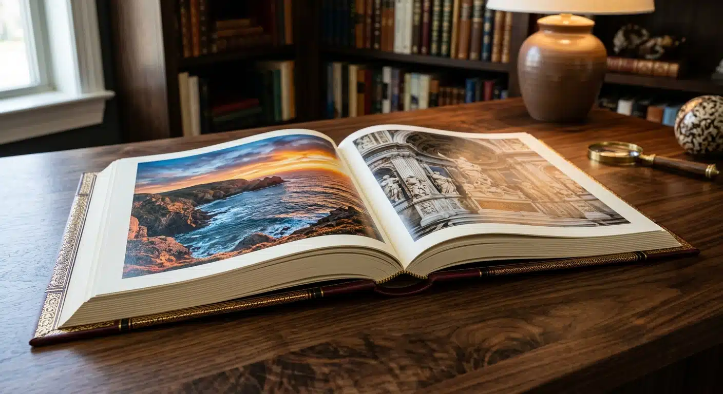
Le défi de la fidélité dans la reproduction artistique
Pour les musées, les galeries et les artistes indépendants, un livre d’art n’est pas simplement un ensemble de pages : c’est un document d’archive de l’œuvre elle-même. Le principal défi de l’impression de livres d’art consiste à combler le fossé entre les couleurs lumineuses et rétroéclairées que l’on voit sur un écran calibré et la réalité physique de l’encre sur le papier. Un léger décalage de teinte ou de saturation peut altérer l’ambiance d’une photographie ou déformer la palette originale d’un tableau.
Pour obtenir des résultats dignes d'un musée, il est indispensable d'adopter une approche rigoureuse en matière de gestion des couleurs. Cela nécessite une compréhension technique de la manière dont les couleurs basées sur la lumière (RVB) sont transposées en impression à base de pigments (CMJN), ainsi qu'un partenaire de fabrication capable de réaliser une impression offset de haute précision. Ce guide présente les étapes essentielles pour garantir que ce que vous voyez à l'écran correspond bien au résultat final livré sur la palette.
Le conflit fondamental : gammes de couleurs RVB et CMJN
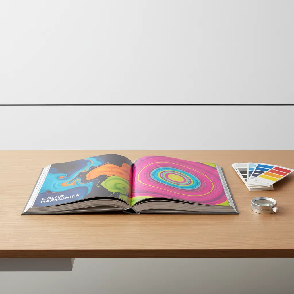
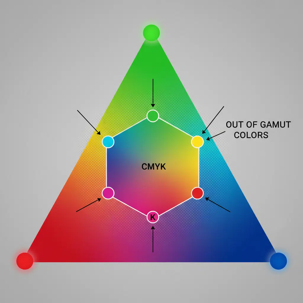
La plupart des écarts de couleur trouvent leur origine dans la différence fondamentale entre les espaces colorimétriques. Les appareils photo numériques et les écrans utilisent RVB (rouge, vert, bleu), un modèle de couleurs additif capable de reproduire une vaste gamme de couleurs vives, semblables à celles des néons. L'impression offset utilise CMJN (cyan, magenta, jaune, noir), un procédé soustractif dans lequel les encres sont superposées pour absorber la lumière.
La gamme de couleurs CMJN est physiquement plus restreinte que celle du RVB. Certaines couleurs — notamment les oranges vifs, les bleus électriques et les verts néon — se situent en dehors de la plage imprimable de l'impression quadrichromique standard. Lorsqu’un fichier RVB est converti en CMJN sans ajustement manuel, le logiciel compresse automatiquement ces couleurs « hors gamme » pour les rapprocher de l’équivalent imprimable le plus proche. Cela se traduit souvent par des tons ternes ou aplatis.
Gestion de la conversion
- Convertissez-vous dès maintenant : Ne confiez pas la conversion RVB-CMJN au processus de rippage automatisé en usine. Les graphistes doivent convertir les images dans Photoshop en utilisant le profil ICC spécifique recommandé par l'imprimeur (par exemple, FOGRA39 ou GRACoL).
- Épreuvage à l'écran : Utilisez un logiciel de conception graphique professionnel pour simuler le rendu des couleurs sur papier. Cela vous permet d'ajuster manuellement la saturation et les courbes afin de préserver les détails dans les zones d'ombre, qui risqueraient sinon d'être noyées lors de l'impression.
Le rôle essentiel des épreuves humides
Dans l'impression commerciale classique, une épreuve numérique (souvent appelée « épreuve traceur » ou « épreuve Epson ») suffit pour vérifier la mise en page et le texte. Cependant, pour les livres d'art où la fidélité des couleurs est primordiale, les épreuves numériques s'avèrent souvent insuffisantes. Les imprimantes numériques utilisent différents toners ou technologies à jet d'encre qui se comportent différemment de l'encre offset.
Épreuves humides (ou épreuves dures) constituent la référence absolue en matière de production de livres d'art haut de gamme. Une épreuve humide consiste à configurer une presse d'épreuvage pour imprimer un seul exemplaire de la cahier à l'aide des plaques offset, de l'encre et du papier réels prévus pour le tirage final.
Pourquoi les épreuves humides sont-elles indispensables pour les livres d'art ?
- Interaction avec le substrat : Elles révèlent précisément comment l'encre interagit avec les fibres du papier. Les papiers non couchés, par exemple, sont sujets au « gain de point » (étalement de l'encre), qui assombrit les images. Une épreuve humide met clairement en évidence cet effet.
- Finitions spéciales : Si votre projet prévoit l'utilisation de vernis UV sélectif, de vernis classique ou d'encres métalliques, une épreuve humide est le seul moyen d'évaluer avec précision le rendu final.
- Couleur contractuelle : Une épreuve humide signée sert de référence pour la fabrication. L'opérateur de presse s'assure que le tirage correspond à cette feuille approuvée, garantissant ainsi l'uniformité du résultat.
Même si les épreuves sur papier impliquent des coûts initiaux plus élevés et prennent plus de temps à réaliser que les épreuves numériques, elles constituent la seule garantie contre des résultats décevants dans le cas d’un catalogue de musée ou d’un ouvrage photographique où les enjeux sont importants.
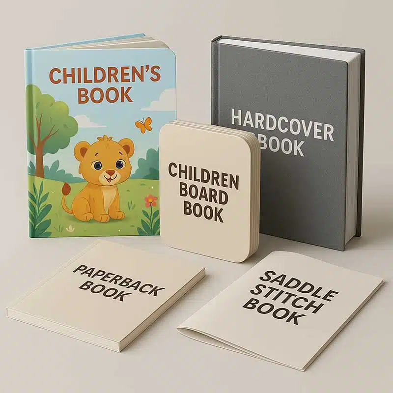
Choix du papier et perception des couleurs
C'est le support qui détermine le résultat. La blancheur, la luminosité et la texture du papier influencent considérablement la perception des couleurs.
- Papier couché brillant/mat : L'encre vient se déposer sur le revêtement, ce qui permet d'obtenir des détails plus nets et des couleurs plus éclatantes. C'est la norme pour les livres de photographie exigeant un contraste élevé.
- Papier non couché / papier d'art : L'encre pénètre dans les fibres. Cela confère au papier un toucher plus doux et plus agréable, souvent privilégié pour les aquarelles ou les archives historiques. Cependant, les couleurs paraîtront plus atténuées. Pour compenser cela, les techniciens de prépresse doivent appliquer des courbes spécifiques afin d'éclaircir les ombres et d'augmenter la saturation.
Demandez toujours des échantillons sur papier vierge pour évaluer le grammage et le toucher, mais fiez-vous aux épreuves imprimées pour évaluer le rendu des couleurs.
Liste de contrôle pré-impression pour la production d'un livre d'art
Afin d'optimiser la production et de réduire au minimum les erreurs, veuillez vous assurer que vos fichiers respectent les spécifications techniques suivantes avant leur envoi :
| Élément | Exigence | Pourquoi est-ce important ? |
|---|---|---|
| Résolution | 300 DPI minimum à l'échelle 100% | Évite la pixellisation et le flou dans les détails des œuvres d'art. |
| Mode couleur | CMYK | Vous permet de contrôler vous-même la variation de couleur, et non la machine. |
| Noirs | Noir intense (par exemple, C60 M40 Y40 K100) | La teinte Standard 100% K apparaît gris foncé sur de grandes surfaces ; la teinte Rich Black offre un rendu profond et neutre. |
| Saignement | 3 mm minimum (standard) | Permet de s'assurer que les images qui s'étendent jusqu'au bord ne soient pas coupées et ne présentent pas de bordures blanches. |
| Polices | En surbrillance ou intégré | Évite les erreurs de substitution de polices. |
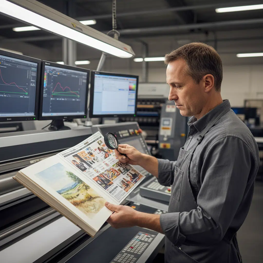
Contrôle qualité en production
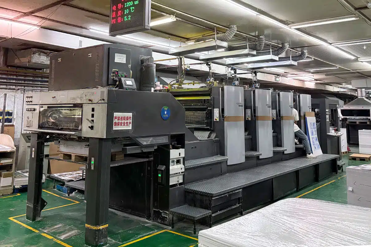
Même avec des fichiers parfaits, le processus d’impression lui-même nécessite des contrôles rigoureux. Les imprimeurs spécialisés dans les livres d’art haut de gamme utilisent des systèmes de contrôle des couleurs en boucle fermée (tels que l’Inpress Control de Heidelberg) pour surveiller la densité d’encre en temps réel. De plus, des conditions d’éclairage standard (généralement D50) doivent être respectées lors de l’examen des épreuves et des feuilles d’impression afin d’éviter le métamérisme, phénomène par lequel les couleurs apparaissent différentes selon la source lumineuse.
Lorsque vous choisissez un partenaire d'impression, renseignez-vous sur ses protocoles d'assurance qualité (AQ). Effectue-t-il des contrôles sur presse ? A-t-il l'habitude de gérer des encres à forte couverture sans risque d'encrage (transfert d'encre sur la page opposée) ?
Résumé : Investir dans la qualité
La réalisation d’un livre d’art digne d’un musée repose sur la collaboration entre la vision de l’artiste et les compétences techniques de l’imprimeur. En prenant en compte les limites du CMJN, en choisissant le papier adapté et en investissant dans des épreuves humides pour les pages cruciales, vous pouvez vous assurer que le produit final rendra justice à l’œuvre d’art originale.
Chez YBJ Printing, nous sommes spécialisés dans l'impression offset haute fidélité pour le monde de l'art et de l'édition à l'échelle mondiale. Nous savons bien que, pour votre projet, « à peu près » ne suffit pas.
Questions fréquemment posées
Q : Peut-on reproduire une couleur Pantone en utilisant le mode CMJN ?
R : Nous pouvons reproduire la plupart des couleurs Pantone à l'aide du mode CMJN, mais certaines nuances vives ne peuvent pas être reproduites à l'identique. Pour les couleurs de marque ou les couleurs artistiques précises, nous vous recommandons d'ajouter une cinquième plaque de couleur Pantone.
Q : Pourquoi mes images paraissent-elles plus sombres sur du papier non couché ?
R : Le papier non couché absorbe davantage d'encre, ce qui entraîne un « gain de point ». Nous tenons compte de ce phénomène lors de la phase de prépresse, mais nous recommandons toujours de vérifier l'épreuve sur le support réel.
Q : Quelle est la quantité minimale de commande (MOQ) pour les livres d'art ?
R : En raison des coûts de mise en route liés à l'impression offset et aux épreuves humides, la quantité minimale de commande (MOQ) la plus rentable commence généralement à 500 ou 1 000 exemplaires. Il existe des options d'impression numérique pour les petits tirages, mais celles-ci peuvent ne pas offrir la même qualité que l'offset pour la reproduction d'œuvres d'art.
Prêt à donner vie à votre livre d'art avec précision et soin ?
Demandez dès aujourd'hui un devis ou un kit d'échantillons