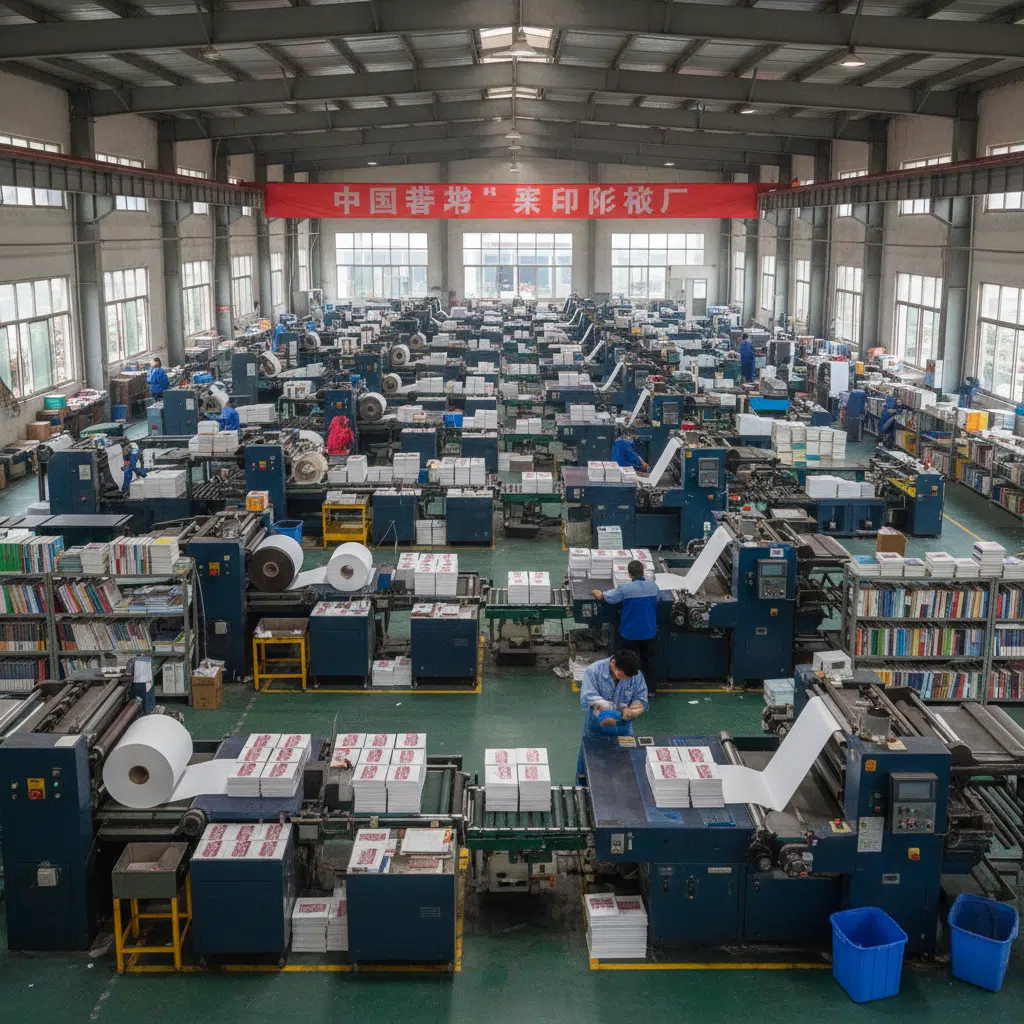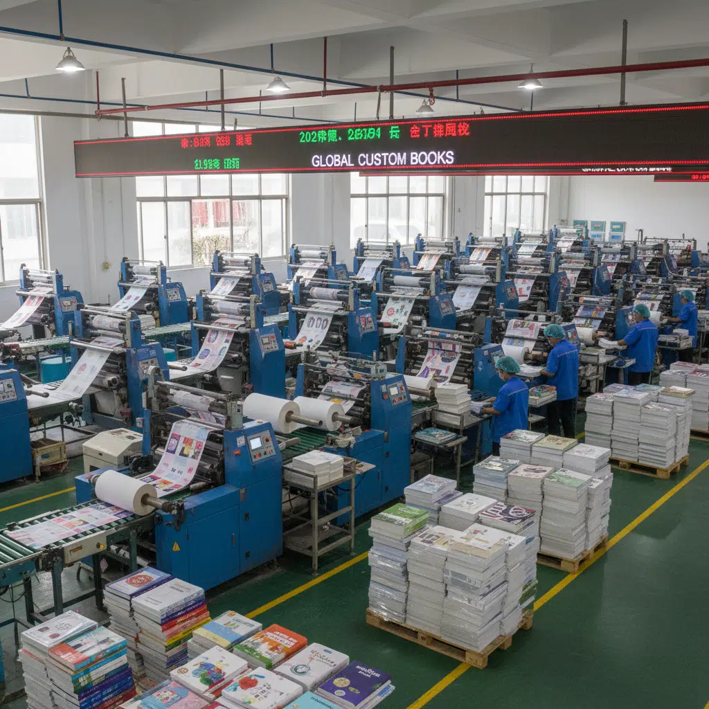
Introduction: The Cost of Color Consistency
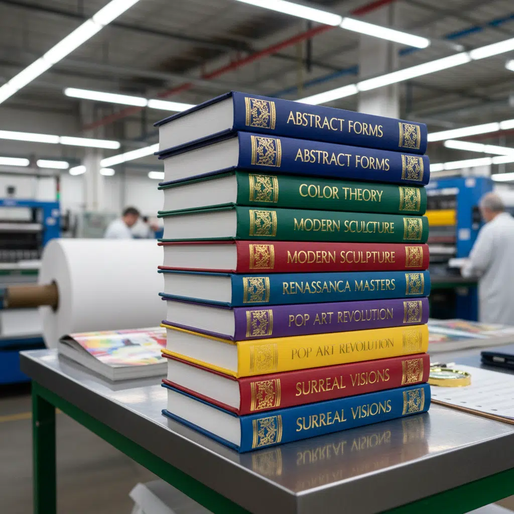
For procurement managers and independent publishers alike, opening a shipment of newly printed books is a moment of truth. The most common point of friction in this process is color accuracy. Why does the corporate blue on the cover look slightly duller than the business card? Why are the skin tones in the photography perfect, but the neon title text lacks punch?
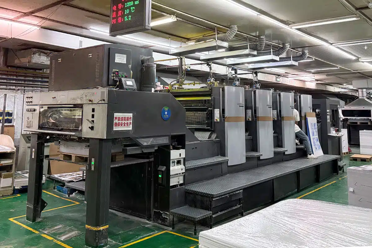
The answer often lies in the choice between CMYK (4-color process) et Pantone (Spot Color) printing. In bulk offset production, understanding the technical and financial trade-offs between these two systems is critical for balancing budget with brand fidelity.
This guide explains the technical differences between CMYK and Pantone, compares their costs in an offset environment, and helps you decide which method aligns with your project’s specifications.
Defining the Systems: How Ink Meets Paper
What is CMYK (4-Color Process)?
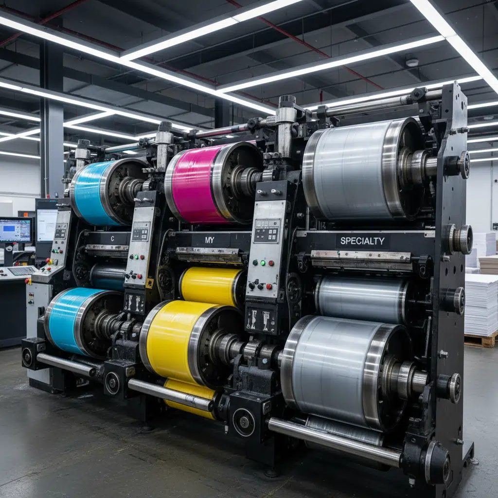
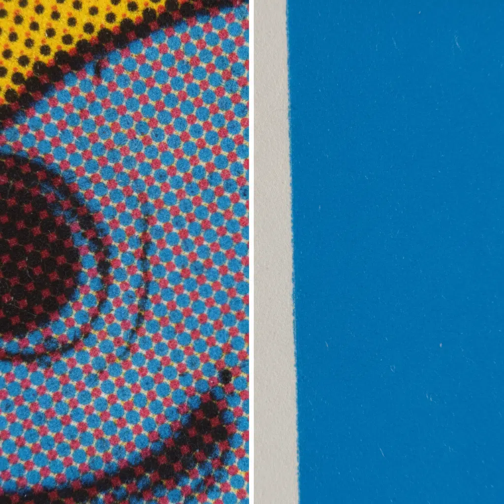
CMYK stands for Cyan, Magenta, Yellow, and Key (Black). It is the standard method for full-color offset printing. In this process, the printing press applies these four ink colors in varying densities of tiny dots (halftones). When viewed by the human eye, these overlapping dots blend to create a full spectrum of images.
- Meilleur pour : Full-color photography, complex illustrations, and gradients.
- Mechanism: Subtractive color mixing on the fly during the print run.
- Limitation: The CMYK gamut (range of reproducible colors) is limited. It struggles to reproduce bright oranges, electric greens, and metallic finishes.
What is Pantone (Spot Color)?
Pantone Matching System (PMS) inks are pre-mixed formulas. Unlike CMYK, which mixes dots on the paper to simulate a color, a Pantone ink is mixed in the factory to a precise shade before it is ever loaded into the press. It is applied as a solid layer of ink using a dedicated printing plate.
- Meilleur pour : Corporate logos, brand-specific colors (e.g., Coca-Cola Red), metallic or fluorescent accents, and large areas of solid coverage.
- Mechanism: Pre-mixed ink applied via a separate print unit (often the 5th or 6th unit on a press).
- Advantage: Absolute consistency across different print runs and paper stocks.
Comparative Analysis: CMYK vs. Pantone
When planning a bulk book order, the decision often comes down to three factors: cost, accuracy, and design requirements. Below is a breakdown of how these methods compare in an industrial offset setting.
| Fonctionnalité | CMYK (Process) | Pantone (Spot) |
|---|---|---|
| Précision des couleurs | Good for images; slight variance possible between runs. | Exact match globally (using PMS guides). |
| Vibrancy | Limited gamut; some brights appear dull. | High vibrancy; capable of neon/metallics. |
| Setup Costs | Standard (4 plates). | Higher (requires extra plates + wash-up fees). |
| Primary Use | Photography, textbooks, magazines. | Logos, covers, brand identity manuals. |
The Cost Implications
In offset printing, cost is driven by setup (plates and makeready) and running speed. CMYK is the standard configuration for most presses. Adding a Pantone color essentially means adding a "fifth color."
If you request a spot color, the printer must:
- Purchase or mix the specific ink.
- Create an additional printing plate for that specific color.
- Stop the press to wash a unit and load the special ink (if not using a dedicated 5-color press).
Verdict: For short runs, Pantone can significantly increase the unit cost. For high-volume bulk printing (e.g., 5,000+ copies), the setup cost is amortized, making spot colors a viable investment for quality control.
When to Choose Pantone Over CMYK
1. Corporate Branding Requirements
If you are printing corporate annual reports, brand guidelines, or marketing books, accurate logo reproduction is non-negotiable. CMYK builds colors using dots; if the registration shifts even slightly, a logo can look fuzzy or change hue. Pantone delivers a solid, sharp edge and exact color match.
2. Large Solid Areas
Printing a book cover with a solid background color using CMYK can be risky. Minor variations in ink balance can cause "banding" or color shifts across the page. A spot color ensures a smooth, rich, uniform flood of ink.
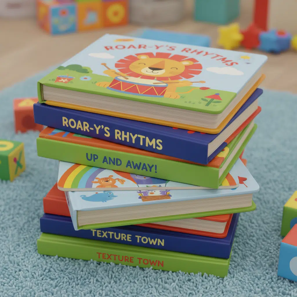
3. High-End Art and Coffee Table Books
Art books often require colors outside the CMYK spectrum. If an artist’s work features bright orange, navy blue, or metallic gold, CMYK will fail to reproduce the intensity. In these cases, a 5-color or 6-color job (CMYK + 1 or 2 Spot Colors) is the standard solution.
Technical Considerations for Bulk Buyers
Paper Stock Affects Color
It is vital to understand that the same Pantone ink will look different on coated (gloss/matte) paper versus uncoated (woodfree) paper.
- Coated (C): Ink sits on the surface, resulting in vibrant, accurate color.
- Uncoated (U): Ink absorbs into the fibers, appearing darker and less saturated.
When specifying a PMS color, always refer to the correct Pantone guide (e.g., Pantone 186 C vs. Pantone 186 U) to align expectations with the substrate.
Préparation des dossiers
To avoid production delays, artwork must be set up correctly in Adobe InDesign or Illustrator. Spot colors must be defined as "Spot" channels, not converted to CMYK process. If you submit a file with a Pantone swatch converted to CMYK, the RIP (Raster Image Processor) will separate it into four plates, negating the benefit of the spot color.
Manufacturing and Quality Control
Proofing Challenges
One of the biggest hurdles in using Pantone colors is proofing. Standard digital proofs (Epson proofs) are generated using inkjet technology, which uses CMYK (or CMYK+). Digital proofs can simulate a Pantone color but cannot perfectly replicate it.
For critical projects, we recommend:
- Wet Proofs: Actual press proofs using the real ink and paper. This is expensive but accurate.
- Drawdowns: A smear of the actual ink on the chosen paper stock to verify the shade before the full print run begins.
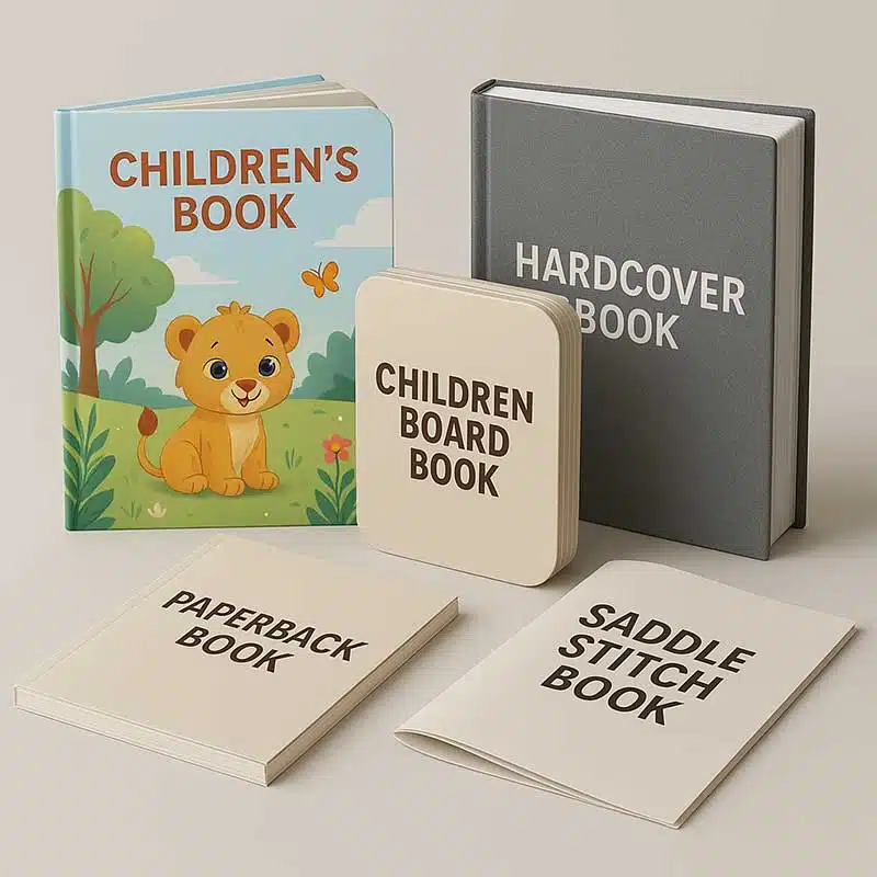
Buying Guide: Ordering Custom Books
When requesting a quote from a professional book printer, clarity is key to receiving an accurate price.
- Specify the Color Count: clearly state "4C/4C" (full color both sides) or "4C + 1 PMS / 4C" (full color plus one spot color on one side).
- Quantité minimale de commande (MOQ) : Due to the setup time for spot colors, MOQs for projects involving PMS inks are typically higher (often starting at 500 or 1,000 units) to make the project cost-effective.
- Provide PMS Codes: Always provide the exact code (e.g., PMS 300 C). Do not say "Royal Blue."
FAQ
Can I convert Pantone to CMYK to save money?
Yes, this is standard practice. However, many colors (especially bright oranges and greens) will look "muddy" or duller after conversion. Consult your printer to see a simulation before deciding.
Is black text considered a spot color?
Generally, no. In standard 4-color printing, black is the "K" in CMYK. However, for high-end text-only books, you might use a double-hit of black or a specific dense black spot color for extra richness.
Why is the setup cost higher for spot colors?
It requires a dedicated printing plate and a dedicated station on the press. The press operator must also wash that station thoroughly before and after the run to prevent color contamination, which takes machine time.
Can you print metallic gold using CMYK?
No. CMYK can simulate a gold tone using yellows and browns, but it will not have a metallic shimmer. Real metallic gold requires a specialty spot ink.
Conclusion
Choosing between CMYK and Pantone is a balance of budget and brand integrity. For most photographic books, CMYK is the industry standard and provides excellent results. However, for projects requiring precise brand matching, metallic effects, or large solid floods of color, investing in Pantone inks ensures a professional finish that stands out on the shelf.
Ready to start your project? Whether you need standard 4-color process or complex multi-spot color printing, accurate file preparation and clear communication are the first steps to success.
Demander un devis / Obtenir un échantillon today to discuss your specifications with our technical team.