

In the typesette of book printing to design , how should the kern of the title be done ?
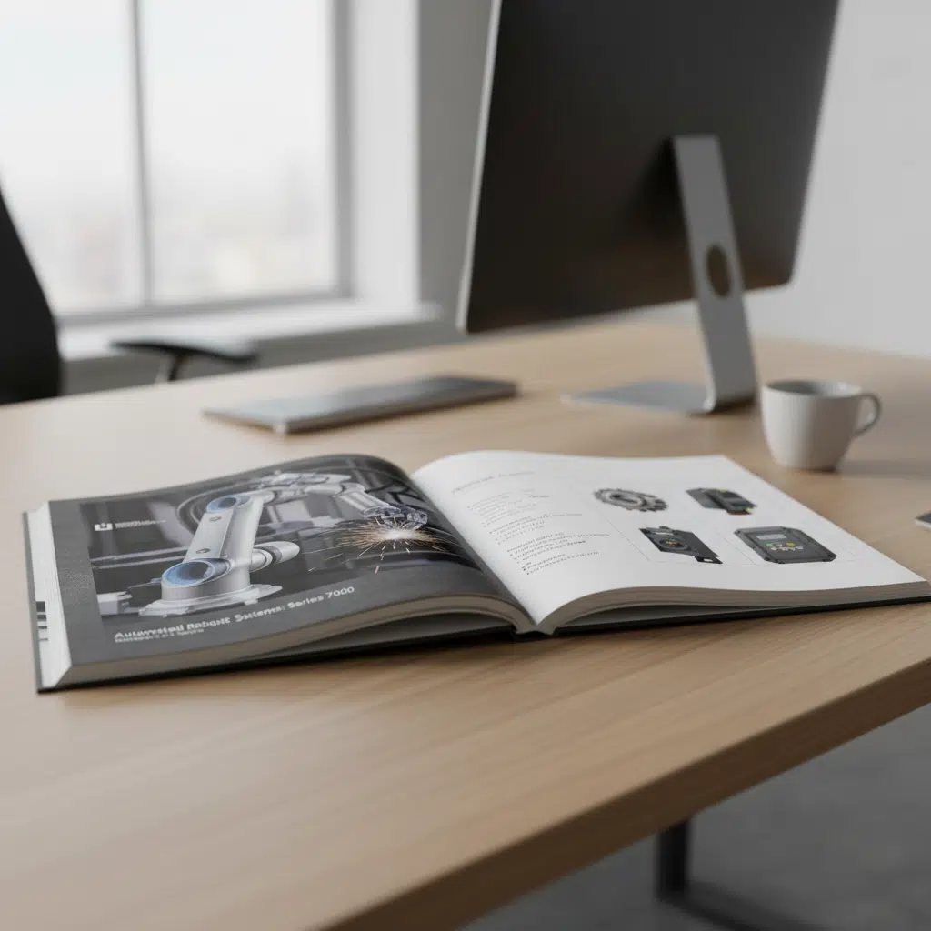
The Art of Precision in Book Layout In professional book printing, the difference between an amateur manuscript and a polished publication often lies in the details of typesetting. While paper quality and binding are visible tactile elements, the internal layout—specifically the spacing and positioning of titles—dictates readability and aesthetic flow. For B2B buyers, publishers, and