The Art of Precision in Book Layout
In professional book printing, the difference between an amateur manuscript and a polished publication often lies in the details of typesetting. While paper quality and binding are visible tactile elements, the internal layout—specifically the spacing and positioning of titles—dictates readability and aesthetic flow. For B2B buyers, publishers, and independent authors, understanding these technical nuances is essential when preparing files for mass production.
One of the most critical aspects of layout design is how titles (headings) interact with the body text. This involves more than just selecting a bold font; it requires precise calculation of vertical spacing (leading), horizontal spacing (kerning), and page positioning. This guide explores the technical standards for title typesetting to ensure your project is ready for the printing press.
Understanding Title Hierarchy and Spacing
Effective typesetting relies on a clear hierarchy. Readers navigate complex texts—whether academic journals, novels, or corporate reports—through visual cues provided by headings. Proper spacing ensures these cues are distinct without disrupting the flow of reading.
1. The Baseline Grid and Vertical Rhythm
A fundamental rule in professional typesetting is that the title layout should align with the document’s baseline grid. As noted in classic design principles, the space occupied by a title is often a multiple of the body text line height. This concept, known as vertical rhythm, ensures that if a title is inserted, the text following it returns naturally to the grid, keeping lines on the front and back of the page aligned (register).
- First-Level Titles (Chapter Heads): These typically command the most space. In standard book formatting, a chapter title often occupies a vertical space equivalent to four to five lines of body text.
- Second-Level Headings (Subheads): These usually occupy two to three lines of vertical space.
- Third-Level Headings: These are more compact, often occupying just two lines of space including the buffer above and below.
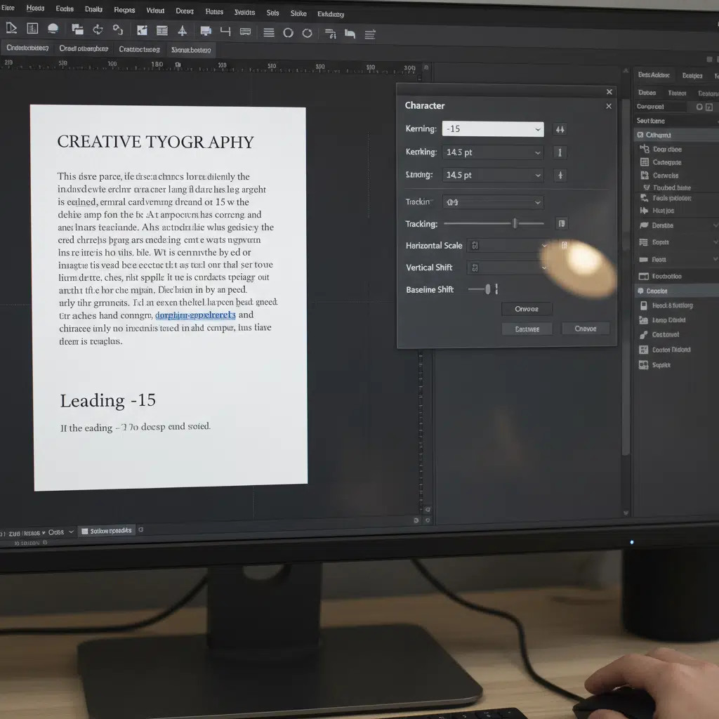
2. Kerning: Horizontal Character Spacing
While the source term “kern” often refers broadly to spacing in translation, technically, kerning is the adjustment of space between individual character pairs. For large titles, standard software spacing (metric kerning) is often insufficient. Titles require “optical kerning” or manual adjustment to ensure letters look evenly spaced to the human eye. This is crucial for high-end printing, as large type reveals spacing imperfections that are invisible at smaller sizes.
Layout Rules for Chapter Openers
When designing for In the typesette of book printing to design , how should the kern of the title be done ?, specific conventions apply to the start of new chapters or major sections. These rules help maintain consistency across hundreds of pages.
Positioning and Sinkage
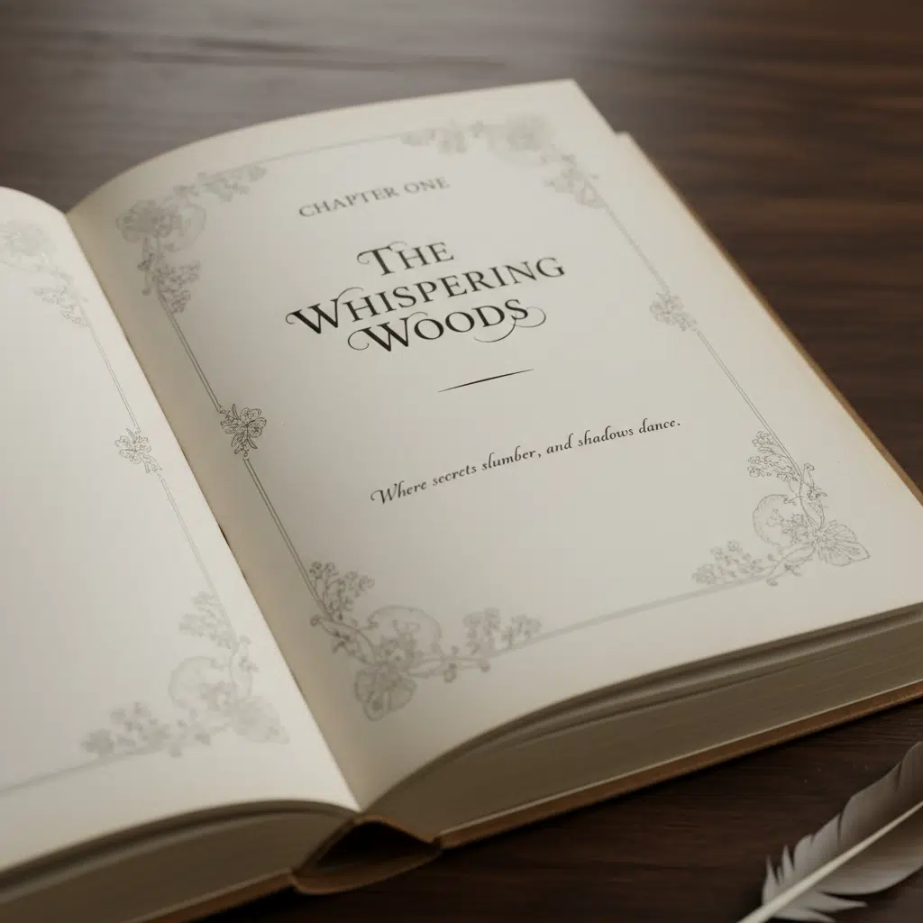
For a standard classic work or novel, the main body is divided into chapters. The first-level title (Chapter Title) does not start at the very top margin. Instead, it employs “sinkage”—deliberate white space at the top of the page.
- Vertical Position: A common standard is to place the optical center of the title at approximately 1/4 down the page height.
- Line Occupancy: If the layout is horizontal, the title block (including white space above and below) might effectively replace six to seven rows of standard text. This creates a visual breath before the reader begins the new section.
Handling Multi-Line Titles
Not all titles fit on a single line. When a heading wraps to a second line (a “return line”), the spacing between these lines (leading) must be tighter than the spacing used for body text. However, the total height of the title block must still calculate out to align with the baseline grid of the main text. This prevents the text on the facing page from becoming misaligned.
Manufacturing Considerations for Layout
Design cannot exist in a vacuum; it must account for the physical binding process.
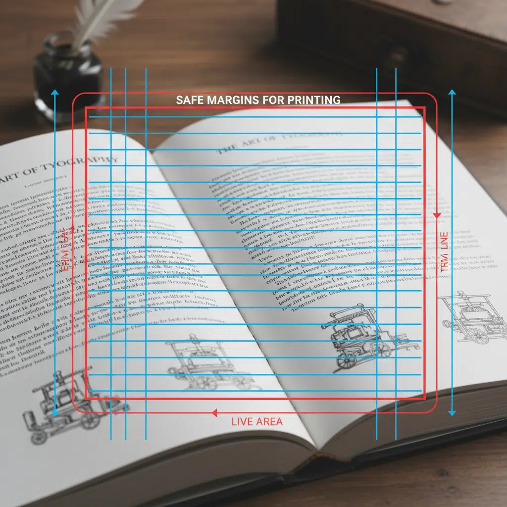
Margins and Gutters
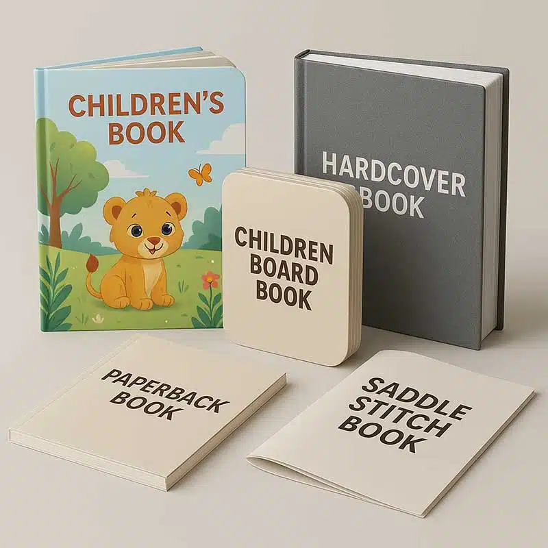
The “gutter” is the inner margin where pages are glued or stitched together. Deep gutters are required for perfect bound books to ensure text doesn’t disappear into the spine. When centering titles, you must center them visually between the visible margins, not the physical page edges. If you center a title mathematically on the page width without accounting for the gutter, it will appear off-center in the finished book.
Creep in Saddle Stitching
For booklets using saddle stitching (stapled spines), the inner pages are pushed outward relative to the outer cover. This phenomenon, called “creep,” means that titles positioned close to the outer edge on inner pages may be trimmed off if not adjusted. Professional imposition software handles this, but designers should leave ample safety margins.
Checklist: Preparing Typography for Print
Before submitting your manuscript to a printing plant, ensure your typesetting meets these technical checks:
- Embed All Fonts: When exporting to PDF, ensure all fonts are embedded or outlined. This prevents “missing font” errors that can alter your carefully planned kerning and spacing.
- Check Black Values: For standard text, use 100% K (Black). For large, bold titles, some designers prefer “Rich Black” (e.g., C40 M30 Y30 K100) for a deeper color, but this requires perfect registration. Consult your printer before applying rich black to text smaller than 24pt.
- Verify Resolution: While text is vector-based, any rasterized effects (like drop shadows on titles) must be at least 300 DPI.
Frequently Asked Questions (FAQs)
What is the difference between kerning and tracking?
Kerning adjusts the space between specific pairs of letters (e.g., the gap between ‘A’ and ‘V’), while tracking adjusts the spacing across an entire word or block of text. Both are essential for polishing book titles.
How much space should be above a chapter title?
This is a stylistic choice called “sinkage.” A common convention is to start the chapter title about 25% to 30% down the page. This white space signals a pause and a new beginning to the reader.
Does the binding method affect my title layout?
Yes. Perfect binding requires larger inner margins (gutters). If your titles are centered, you must center them within the “live area” (the visible space after binding), not the raw page size.
Can I use system fonts for book printing?
You can, but professional typefaces often include more complete character sets, ligatures, and better default kerning tables, which result in a more professional look for printed books.
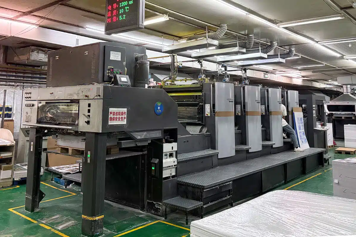
Partner with Expert Printers
Perfect typesetting deserves perfect execution. At our printing facility, we combine advanced offset and digital printing technologies with a deep understanding of layout aesthetics. Whether you are printing a classic novel, a corporate catalog, or an educational textbook, we ensure that every kern, lead, and margin is reproduced exactly as intended.
Ready to bring your book to print? Contact us today to discuss your project specifications and receive a custom quote.