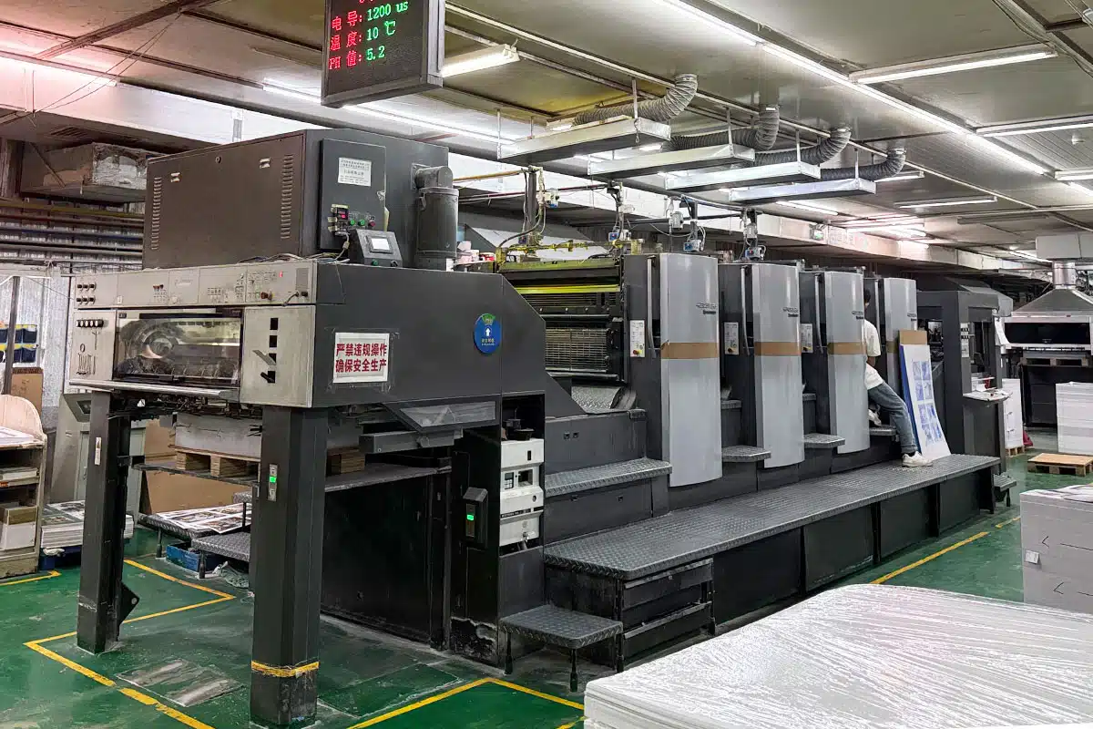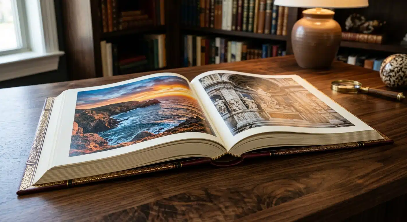
In the competitive landscape of B2B marketing, a physical product album (often referred to as a product catalog or brochure) remains a powerful tool. While digital marketing is ubiquitous, a high-quality, tactile product album signals reliability, permanence, and professional capability. It is often the final piece of collateral a procurement officer reviews before making a purchasing decision.
However, a successful album requires more than just high-resolution photos. It demands a strategic approach to product album design and typesetting. The layout must guide the reader’s eye, the typography must ensure readability, and the technical specifications must be perfectly aligned with professional printing standards.
This guide explores the essential skills required to design effective product albums, from visual hierarchy to pre-press preparation, ensuring your final print run delivers maximum impact.
The Role of Layout in Product Album Design
Layout is the backbone of any printed material. In product album design, the goal is to organize complex information—specs, descriptions, and images—into a digestible format. A chaotic layout can confuse potential buyers, while a structured one builds trust.
Establishing Visual Hierarchy
Visual hierarchy tells the reader what to look at first. It is achieved through size, color, and positioning. A well-structured page typically follows this flow:
- Primary Theme/Header: The largest element, usually the product category or name.
- Hero Image: A high-quality visual that anchors the page.
- Subheadings: These break down features or specifications.
- Body Text & Specs: The detailed data, kept legible but secondary to the main visual cues.
The Power of the Grid System
Professional typesetters use grid systems to maintain consistency across dozens or hundreds of pages. A grid ensures that headlines, images, and page numbers align perfectly from page to page. This “invisible structure” makes the album feel cohesive and reduces visual fatigue for the reader.
Strategic Use of Whitespace
One of the most common mistakes in Product album design and typesetting skills is overcrowding. Whitespace (or negative space) is not wasted space; it is an active design element that allows the content to breathe. Generous margins and padding around products make the album look premium. In contrast, clutter suggests a lower-end commodity.
Typesetting Skills for Print Readability
Typesetting is the art of arranging text. In a product album, where technical data is crucial, clarity is paramount. Poor typesetting can lead to misread specifications, which can be disastrous in B2B transactions.
Font Selection and Pairing
Limit your design to two or three font families. A common practice is to pair a robust Sans Serif font (like Helvetica or Roboto) for headers and technical tables with a highly readable Serif font for longer descriptive paragraphs. Ensure the fonts selected have a wide range of weights (Light, Regular, Bold, Black) to create contrast without changing the typeface.
Paragraph and Character Spacing
Leading (Line Spacing): For body text, the line spacing should generally be 120% to 145% of the font size. Tighter spacing makes large blocks of text difficult to scan.
Kerning and Tracking: Adjust the space between characters (tracking) to ensure density is balanced. Avoid “widows” and “orphans”—single words left alone at the top or bottom of a column—as they disrupt the reading flow.
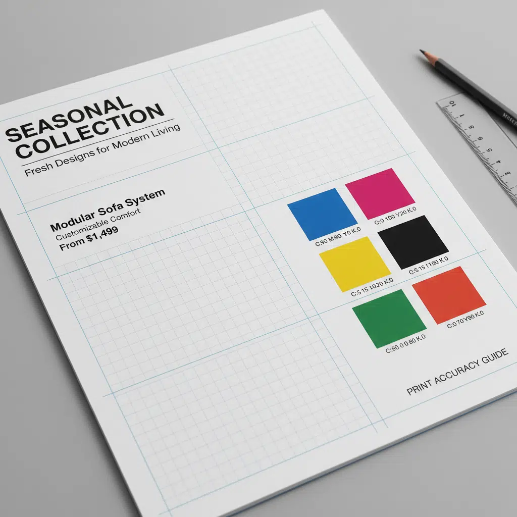
Technical Tip: Black Text in Print
When typesetting black text, ensure it is set to 100% K (Black) rather than “Rich Black” (a mix of CMYK). Rich black is excellent for large headlines or backgrounds but can cause fuzziness in small body text if there is even slight registration misalignment during the printing process.
Technical Considerations for Manufacturing
Even the most beautiful design can fail if it isn’t optimized for the manufacturing process. Understanding the physical constraints of printing is part of advanced product album design.
Image Resolution and Color Mode
- Resolution: All images must be at least 300 DPI (dots per inch) at their final print size. Web images (72 DPI) will appear pixelated and blurry in print.
- Color Mode: Convert all files to CMYK before finalizing. Designing in RGB (screen colors) often results in duller colors when printed, as screens can display a wider range of neon/bright colors than ink on paper can reproduce.
Bleeds and Safety Margins
If an image runs to the edge of the page, you must include a bleed (typically 3mm or 0.125 inches). This extra image area is trimmed off after printing to ensure no white hairline edges remain. Conversely, keep critical text and logos inside a safety margin (at least 5mm from the trim edge) to prevent them from being cut off.
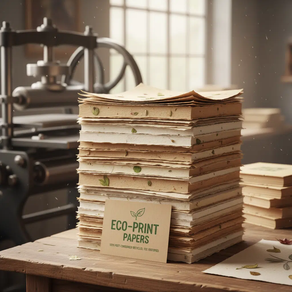
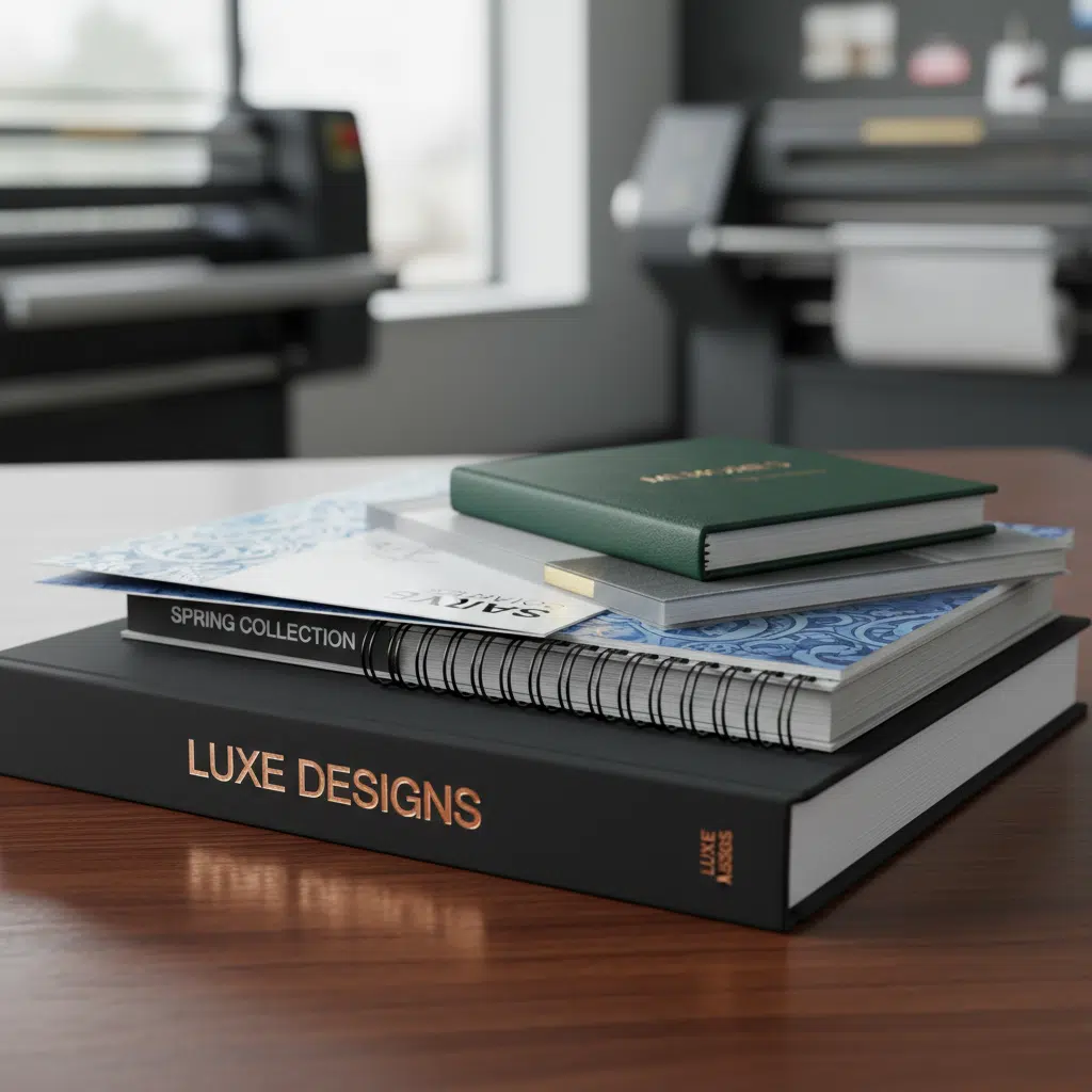
Paper Selection and Finishes
The tactile experience of your album influences perception. Consider these options:
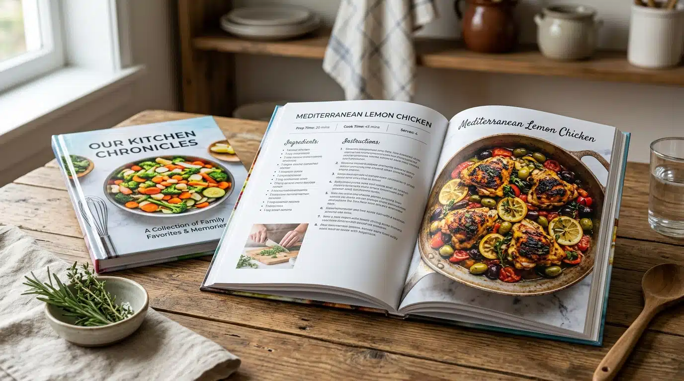
- Coated Paper (Gloss/Matte): Standard for product photos as ink sits on the surface, appearing vibrant.
- Uncoated Paper: Offers a natural, premium feel but absorbs more ink, making colors softer.
- Special Finishes: Enhance the cover with Spot UV (glossy varnish on specific areas), Foil Stamping (metallic effect), or Embossing (raised texture) to make your brand logo stand out.
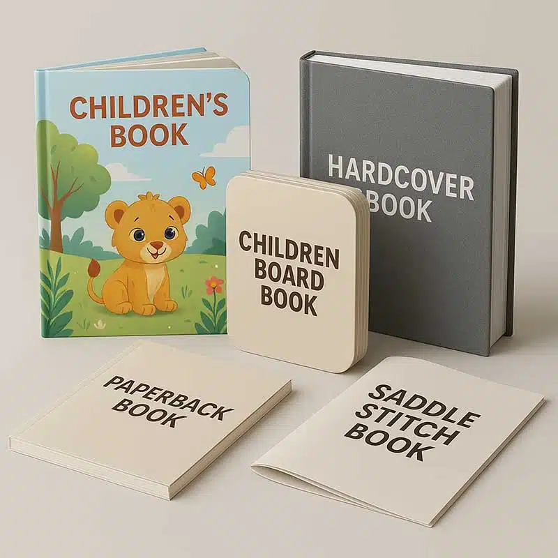
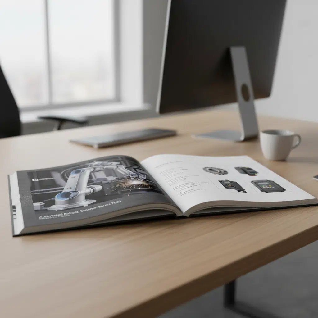
Binding Styles and Page Count
The method of binding dictates how you should design your spreads (pages facing each other).
| Binding Type | Ideal Page Count | Design Consideration |
|---|---|---|
| Saddle Stitch | 8 to 64 pages | Pages must be in multiples of 4. Content can flow across the center fold easily (crossover images). |
| Perfect Bound | 40+ pages | Uses a square spine. Avoid placing text too close to the spine (gutter) as it may get lost in the glue binding. |
| Wire-O / Spiral | Any (esp. manuals) | Great for albums that need to lay flat. Leave a wide margin on the binding edge for the punched holes. |
Buying Guide: Preparing for Print Production
When you are ready to send your product album design to a professional printer, keep the following logistics in mind:
1. File Handoff
Supply high-resolution PDFs with crop marks and bleeds. Outline your fonts or package them with the file to prevent font substitution errors.
2. Proofing
Always request a hard proof (physical sample) for color-critical projects. A digital proof (PDF) is useful for checking typos but cannot accurately predict final color output on specific paper stocks.
3. MOQs and Lead Times
Offset printing typically becomes cost-effective at quantities of 500 or 1,000 units. Digital printing is suitable for smaller runs (50–200). Production times vary from 5 to 15 business days depending on complexity and finishing options.
FAQ: Product Album Design and Printing
What is the difference between a product album and a brochure?
A brochure is typically a folded single sheet (like a tri-fold) used for brief introductions. A product album (or catalog) is a multi-page booklet used to showcase comprehensive product lines, specifications, and company details.
How do I choose the right paper weight?
For inner pages, 105gsm to 157gsm coated art paper is standard. For covers, a thicker 250gsm to 300gsm cardstock is recommended to provide durability and a premium feel.
Can I use images from my website for my printed album?
Usually, no. Website images are optimized for speed (low resolution, 72 DPI). For print, you need high-resolution original photography (300 DPI) to ensure sharpness.
Why do the colors on my screen look different from the printed album?
Screens use light (RGB) to create color, while printers use ink (CMYK). Some bright screen colors cannot be perfectly replicated with standard inks. Professional designers use CMYK color charts to predict final results accurately.
Elevate Your Brand with Professional Printing
Effective product album design and typesetting are about more than aesthetics; they are about communication and precision. A well-executed album serves as a silent salesperson, presenting your inventory clearly and professionally.
Whether you need a small run of premium lookbooks or high-volume industrial catalogs, attention to layout, typography, and print specifications is key to success.
Ready to bring your product album to life? Contact us today to discuss your project, request paper samples, or get a custom quote.